Category Archives: Design

Final Portfolio

Link to Presentation on SlideShare

Message/Audience:

My message is to sell myself and show off project that I have done well.  My audience is future employers that would like to see what I have done before hiring me.

Process:

I began with an introduction slide and then decided to make an ending slide that was just a little opposite of it.  After that I was able to duplicate the beginning slide, insert a jpeg image of my projects and change the colors to match the images.  I really think the color shapes at the bottom added a nice element that helped tie the slides together.  Last I chose a nice font that would be easy to read and aligned it with my images to create a nice flow throughout the presentation.

Critiques:

This week I critiqued Leah Goodwin, Tiffany Carbajal and Charity Jacobs. I received a critique from Leah Goodwin and William Mark.  They mentioned that my social media slide need some improvement by making the images a little larger.  They also mentioned that my movie poster seemed to small.  Sister Peterson also mentioned those same things along with suggesting that I make sure the top and right sides of my images are the same spacing.  I fixed all those and even though when uploaded the presentation adds black to the top making it look off I did set the top and side spacing to be the same.

Magazine Spread

Message/Audience:

My message is directed to families, especially parents who find their children spending too much time connected to their electronics.  It is a message of help to take time as a family and purposefully disconnect to reconnect with those around us.

Process:

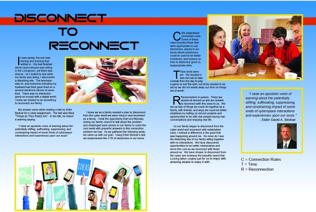
I began with deciding what to write my article about.  I took a recent project that our family has taken on to disconnect and wrote it up as my article.  Then I found images that I felt represented the subject of disconnecting and sketched out many designs that I thought would work.   After narrowing it down, I built a shape map to help me see how it would all look.

Sketches

Sketches

Shape Map

Shape Map


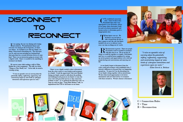
Then I began inserting my images into the shape map and as you can see my final project was quite different after I worked with the shapes and images to get a perfect balance and alignment.  I think this project turned out great and I enjoyed learning more about design and using InDesign.

magazine

Critique

I critiqued Lauren Forson, Kaley Sullivan and Tiffany Carbajal this week on their awesome Magazine spreads.    I received critiques from Lauren Forson, Alli Bohls and Tahnee Smallwood.  They all mentioned I was having some trouble with my alignment and that my CTR key could be better places.  I played around with my spread and was able to fix both these problems.  I also received feedback from Sister Peterson who mentioned that my images needed unifying so I added a stroke around all the images to unify them.

Fonts: Header: Gtek Technology (Decorative) ; Body: Arial-Regular and Italics (Serif)

Color Scheme: Blue, Orange and Yellow (Split Complementary)

Links to Images:

Image 1: http://www.lifehack.org/articles/lifestyle/7-good-reasons-make-you-turn-off-your-smartphone-now.html

Image 2 http://bigthink.com/ideafeed/unplug-yourself-this-holiday-season

Image 3 http://www.copfamily.com/holidays/

Image 4: http://www.understandingmormonism.org/david_a_bednar

Magazine Spread Draft Critique

magazine

Sketches

Sketches

Shape Map

Shape Map

Message/Audience:

My message is directed to families, especially parents who find their children spending too much time connected to their electronics.  It is a message of help to take time as a family and purposefully disconnect to reconnect with those around us.

Process:

I began with deciding what to write my article about.  I took a recent project that our family has taken on to disconnect and wrote it up as my article.  Then I found images that I felt represented the subject of disconnecting and sketched out many designs that I thought would work after narrowing it down, I built a shape map and then inserted my images and article to come up with this final layout so far.

Fonts: Header: Gtek Technology (Decorative) ; Body: Bodoni MT-Regular and Bold (Serif)

Color Scheme: Blue, Orange and Yellow (Split Complementary)

Links to Images:

Image 1: http://www.lifehack.org/articles/lifestyle/7-good-reasons-make-you-turn-off-your-smartphone-now.html

Image 2 http://bigthink.com/ideafeed/unplug-yourself-this-holiday-season

Image 3 http://www.copfamily.com/holidays/

Image 4: http://www.understandingmormonism.org/david_a_bednar


Web Page Layout

11A_ShanaleeManwaring

Shape Map

Sketch

Beginning Sketch

Message/Audience:

My audience is people who want to buy cupcakes for any type of occasion. My message is that this company “Cupcake Heaven” will make any type of cupcake you need for Birthdays, Weddings or any other occasion you can think of even just for a treat.

Proccess:

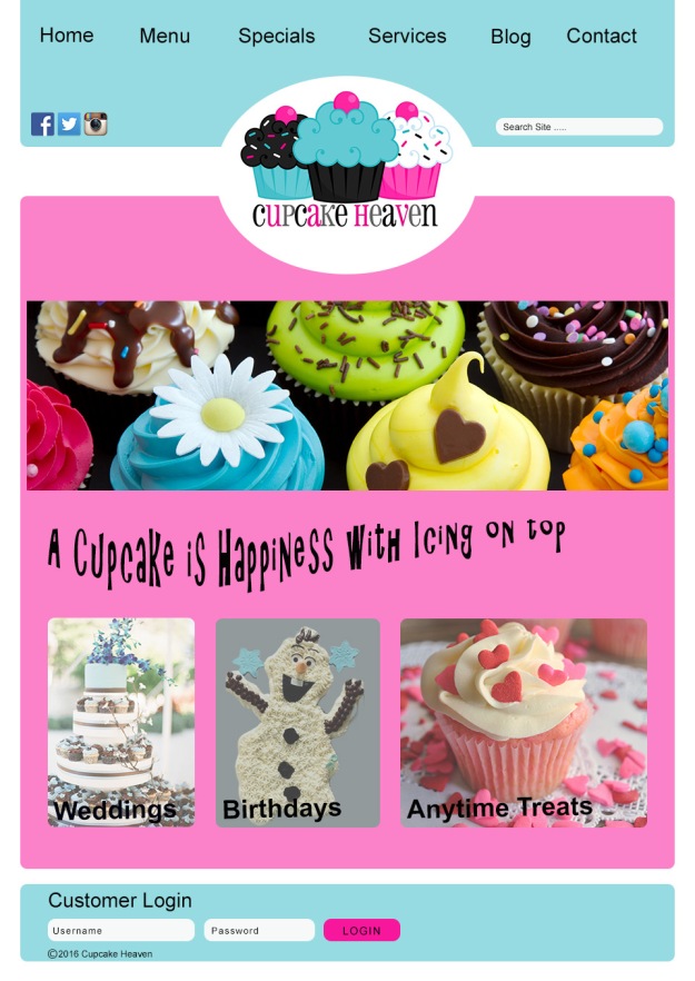
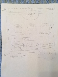
As I was trying to come up with a website idea my daughter suggested I do it on her favorite treat, cupcakes.  It sounded like a fun idea so I started by looking at other cupcake websites to get ideas on layout and colors.  I first stumbled on the logo that I used and it was easy to find other images that would go with the color scheme.  I then began by drawing out how I wanted my site to look with shapes to represent the different areas.  After playing with my rough draft, I created a shape map with photoshop to get a skeleton of my site.  The shape map made it very easy to combine my images and text to get my final product.

Critiques:

This week I critiqued Alli Bohls and Leah Goodwin on their projects.  I also was able to have Liz Miller and Alli Bohls critique my project.  They mentioned that some of the typography was hard to read.  Sister Peterson also mentioned my typography and so I played around with the different text and was able to fix the problems.  Sister Peterson also mentioned a couple areas that were causing a tangent and I was able to fix them.

Color Scheme:

Split-Complementary (Pink, Teal and Brown)

Fonts:

Arial-San Serif (Normal and Bold);  Christy-Decorative (Tag line); Minya Nouvell- Serif (Logo)

Links to Images:

Heart Cupcake: http://houseofyumm.com/valentines-day-cupcakes/

All Cupcakes:  https://wall.alphacoders.com/by_sub_category.php?id=194869

Logo: https://www.pinterest.com/marcozeek/cupcake-logos/

Social Media Image: http://www.contentsocialpanels.com/

Birthday Cake: http://www.sweetdiaries.com/home/category/cupcakes

Wedding Cake: http://thecakezone.com/blog/graduation/sweet-battle-continues-cupcakes-vs-wedding-cake/


Movie Poster Project

10A_ShanaleeManwaring


Message/Audience

I wanted to take a fun twist on one of my favorite movies that would describe me a little.  My message is a fun twist on the reality of life, every girls turns into her mother.  It also helps to describe me a little with the props we used, but also that I am a mother of teenagers.   My audience is anyone who wants to get to know me a little better through this movie poster.  My family, friends, or even an employer would be able to see a little glimpse of me.

Proccess

I began by picking one of my favorite movies and then sketched out how I would put them onto a poster.  I took a picture of my daughter first and then set up the camera for her to take a photo of me.  Then I was able to use photoshop and cut each of us out and put those cutouts onto the background.  Once those were on I added text and played with different image settings to get it perfect.

Critique Report

This week I critiqued Alli Bohls and Carrie Hunt.

I was critiqued by Alli Bohls and Charity Jacobs.  They both mentioned that I might add movie information like a rating and opening date, but as I looked at the rubric and past projects that did not seem to be a required element and I liked not having those on the poster so I did not add them.  Sister Peterson mentioned going over the edges of the hair to make it look more natural so I did that and it did make it look better on my poster.

Fonts

Title and Star Names: AdLib Regular – Decorative

Body Copy: Arial Narrow and SF Movie Poster Regular – Both San Serif

Images

The images of me and my daughter were taken by me. Background colors came from:

Green stripes: http://www.bianoti.com/green-striped-background.html

Purple stripes: http://pixhder.com/purple+striped+background

Photographic Study

The Garden

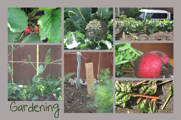
Collage

I decided to take pictures of my husband’s pride and joy our garden.  I created this fun collage just for him.  It turned out great and just in time for Father’s Day.ShanaleeManwaring-Collage

Texture

Here I took a photo of a strawberry bud and added a texture of rain to the image to create a feel of being watered.

Textured Image: After a rain storm.

Textured Image: Rainstorm.

Images

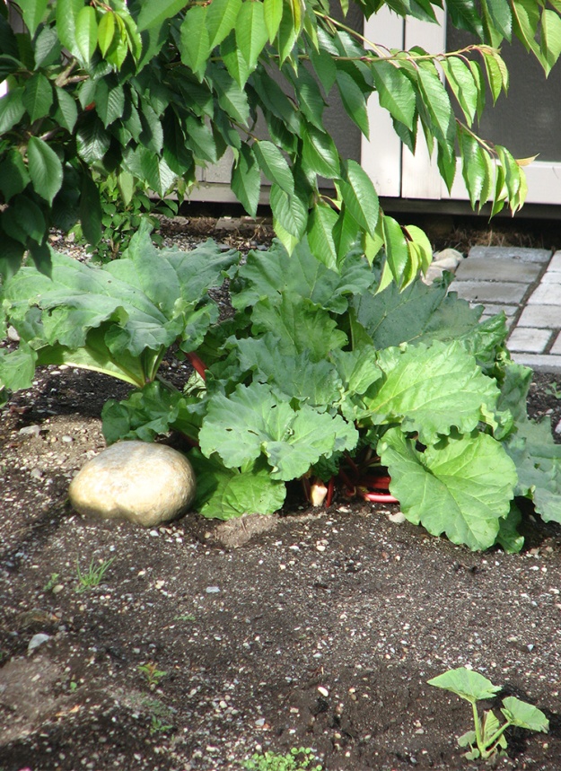
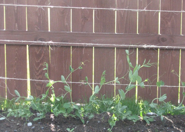
Here are a few of the other pictures that were not included in my collage:

Rhubarb Plant

Rhubarb Plant

Roots

Roots

The start of a pumpkin

Pumpkin flowers

Peas

Peas

Process

I knew that I wanted to take pictures of something outdoors because I love natural light photography.  I decided to take pictures of our garden because it is just starting to grow and it had some fun colors that would pop.  After I had taken quite a few pictures outside it started to rain so I picked a couple radishes and brought them inside and tried my new indoor lighting skills to take a few more pictures close up of the radish.  The rain also inspired my texture picture so I found a perfect image at http://www.textures.com/ .  Using photoshop I was able to edit all my pictures and create a fun collage, a texture picture and edit my other photos.

Critiques

This week I critiqued Kaley Sullivan and Tiffany Carbajal.  I also received great feedback from Sister Peterson, Kristen Dunnell, Lindsey Meeker, and Charity Jacob.  They all mentioned that my text needed work so I decided to create a space that was not on top of the photos to put my text so it would stand out better.  Lindsey mentioned I might make my background a color instead of just white.  I first tried red to match the radish color, but it just didn’t feel right so I played around with different colors and settled on a gray which was subtle enough to help the reds still stand out.


LFC Photography Activity

Light 1: Outdoor

Light 1: Outdoor

Light 2: Indoor

Light 2: Indoor

Focus 1: Foreground

Focus 1: Foreground

Focus 2: Background

Focus 2: Background

Composition 1: Rule of Thirds

Composition 1: Rule of Thirds

Composition 2: Lead Room

Composition 2: Lead Room

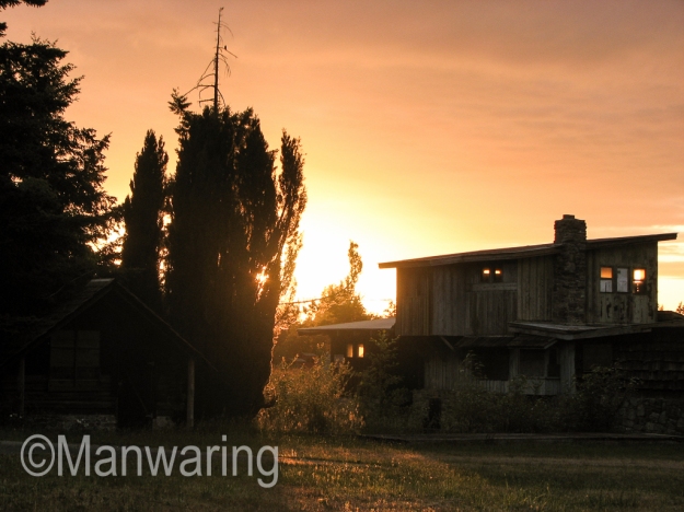
I had to take advantage of the only day this week with some sun here in Washington.  My outdoor image was at sunset of a barn that I pass by when driving home.  It was fun to learn that you have to focus first on the sky to get a good picture.  My indoor picture used light from the window in the morning to get a good shot.

My foreground and background image was fun to figure out.  I took many shots before I was able to figure out the blur.  I got this shot while looking down my street and finding images that were really far apart. I love how the detail of the purple leaves are shown in the foreground image.

My thirds picture is of an old abandoned building near our home.  Again I was taking advantage of the only day of sun here in Washington and was able to capture the sun setting behind this building.  I was a little tricky to get the building and tree set on the third lines, but when it all came together it worked great.  My lead room image came when I was just playing around in my front yard.  I loved being able to use something other than a person to create this image.

LIghtroom is a fun tool that made editing my images fast and easy.  I really liked the exposure option that helped lighten some of my images that were taken in the evening.

Social Media Marketing Project

Company: Tacoma Institute of Religion

Objective/Audience: Help increase the number of students attending classes at the institute. Mostly focusing on the young single adults in the Puget sound area of Washington.

Strategy/Message: Create a new banner, profile image and 3 posts that will introduce and encourage potential students to the blessings that come when they take time to attend institute.  I also included the hashtag #growstronger, which is the emphasis of the Tacoma institute council for the current year.

Banner/Profile Image

Banner

Post #1

Post1

Post #2

Post2

Post #3

Post3

Process: I chose to update my husband’s institute web site for this project.  I began by putting together the current church wide institute theme of “Elevate Learning” along with the Tacoma Institute theme of “Grow Stronger”.  I wanted to encourage the young single adults in the Tacoma area to discover what blessings come from attending Institute.  I was able to find a fun site called fotor that is free and will help you create a facebook banner.  I then found images on LDS.ORG that were about institute and young single adults to create some fun posts to encourage institute class attendance.

Critique: This week I critiqued Jacob Hayes & Emma Merrill.  I was able to get great feedback from Allie Bohls & Carrie Hunt.  Both mentioned that I should find a way to make my posts have some repetition.  I was able to make both images similar with some repetition, but it was hard to do that with the video on facebook, because when you input the url you get whatever photo comes up.  Sister Peterson also mentioned it would be good to have the person in my banner image looking at words so I moved my text boxes around to create that effect.

Font:    Titles: Lora -Serif   |  Hashtags: Bebas – Sans Serif

Image Sources:

Banner Image/Post #2 & #3 Images: https://www.lds.org/si/institute?lang=eng

Post #1 Video: https://youtu.be/zCKiQciD0AU

Profile Image: https://www.facebook.com/ldsinstitute/


Magazine Content and Sketch

I will create a 2 page spread for the LDS magazine “Ensign” with this assignment.  The audience for my article is parents who are struggling with the disconnect of their family because of electronics.  I will share how our family chose to begin combating this problem in hopes of inspiring other families to sit down and come up with their own plan of action.

My Story:  Time to Disconnect

It was spring, the sun was shining and evening had settled in.  We had finished dinner and everyone was sitting in the Living room, yet there was silence.  As I looked to see what my family was doing, I discovered a disturbing site.  The television was on, and everyone including my husband had their gaze fixed on a second electronic device of some kind.  There was no interaction going on except with a digital world.  I knew we needed to do something to reconnect our family.

My answer came while reading a talk by Elder Bednar for a class assignment.  The talk was titled, “Things as They Really Are”.  In his talk, he raised a warning saying,

“I raise an apostolic voice of warning about the potentially stifling, suffocating, suppressing, and constraining impact of some kinds of cyberspace interactions and experiences upon our souls.”

I knew we as a family needed a plan to disconnect from the cyber world we were living in and reconnect as a family.  I took the opportunity that next Monday during our family council to talk about the problem and challenged each person in our family to come the next week with prayerful answers to this connection problem we had.  As we gathered the following week, we came up with our plan.  Using Elder Bednar’s talk, we implemented the CTR of electronics in our home.

C = Connection

T = Time

R = Re-connection

Connection

We established connection rules.  Some of those rules included times that were appropriate to use electronics.  We established  places in our home where electronics could be used to be better monitored and had lessons on how to determine good vs. inappropriate sites.

Time

Time limits were set.  We decided it was not bad to take a break from the day to play a game or surf the web, but limits needed to be set so we did not waste away our time on things not of worth.

Re-Connection

Re-connection with people.  There are people all around us and we needed to reconnect with those close to us.  We set up lists of things we could do together as a family, with friends, and neighbors.  Some of those activities were service projects, making treats to take out, visiting ward members and other activities that involved being with  people face to face and  having real conversations.

As our family began to disconnect from the cyber world and reconnect with established rules, I noticed a difference in the good that was happening around me.  No more do I see the disturbing site of my family sitting together with no interactions.  We have discovered opportunities to be better missionaries and serve the Lord as we reconnect with those around us.  We have chosen to disconnect from the cyber world and embrace the beautiful world that a loving father created just for us to enjoy with amazing people to enjoy it with.

Sketches

sketch

Images

Electronics

Family Playing Cards In Kitchen

phone

Image Sources

Electronics Image:  http://www.philadelphia-electricians-how-to.com/2014/11/understanding-importance-of-home.html

Family Image: http://www.copfamily.com/holidays

Cell Phone Image: http://www.wallpapersis.com/wallpaper/headphones-black-hi-tech.html

Slideshow

Speakers Outline

Story of the Forget-Me-Not flower

Forget not to be Patient with yourself

  • We are not perfect
  • Everyone has strengths and weaknesses
  • Thankful for small successes

Forget not the difference between a Good sacrifice and a Foolish Sacrifice

  • Good sacrifices
    • Helping children
    • Time for scripture study
  • Foolish sacrifices
  • Am I committing time to things that matter most?

Forget not to be Happy Now

  • Willy Wonka, Joy in a candy bar
  • Golden Ticket
  • Waiting for roses, we miss the Forget-Me-Nots

Forget not the “Why” of the Gospel

  • “Why’s”, not a long list of tasks
  • Remembering “Why” brings joy

Forget not the Lord Loves You

  • You are not forgotten

Summary

  • Don’t forget, you are doing good

Audience

My audience is mostly Women, but could also incompass all.  It is for those who look at their life and feel like they are not doing enough.

Message

The message is that if we will just stop and take notice of the small things we will see that we are doing better than we thought.

Process

I first found one of my favorite talks from Elder Dieter F. Uchtdorf “Forget Me Not” that he gave in October 2011. Then I began by writing up my outline (see above).  After the outline was finished I worked on finding different images that I felt best represented the points of the talk.  After finding enough images to fill a 7 slide presentation I drew up a sketch of what I wanted the presentation to look like (see below).   I wanted to have a consistent theme of the forget me not flower throughout my slides and used an image to do that.  I wanted to find images that depicted women who fit each category that would make it easy to cue the speaker about what they were talking about, and giving the viewer a real life image to relate to.

Sketches

Critique

I took my design to facebook where both Carrie Hunt and Beth Kirby shared some great insight with me about my 3rd slide having two images that seemed to break the flow of the slideshow.  It was great advice and I decided to change that slide to one image to make it more consistent with the entire presentation.  My Client (Teacher) also suggested that I create a small drop shadow on my small words to create a 3D effect which really helped enhance the look of my slides.

I was able to critique Lindsey Cordova and Kaley Sullivan this week.

Color Scheme: Triadic (with light tones of Lime, Indigo, Brick)

Fonts:    Large Title/Body, Josefine Sans-Serif | Small Title, Throw my hands up in the air Sans-Serif

Link to the talk: Forget Me Not by Dieter F. Uchtdorf

Link to images: Slide 1Slide 2Slide 3, Slide 4Slide 5Slide 6